“One eye sees, the other feels.” – Paul Klee (1879-1940)
 My fascination with the tintypes that are the basis for these explorations of portraiture goes back to childhood. I was a curious
 child probably under the age of ten when I first picked up and examined the tiny album that held these tintypes; an album which belonged to my great grandmother Isabelle Pierson Hurd [Waterhouse] (1852-1890). Bound in decorative pressed leather
 measuring 2″ height x 3-1/4″ width, with a spine of 7/8″, the album contains 12 two-sided cardboard pages measuring 1-3/4″ height x 3-3/16″ width. To each side of the cardboard a thinner paper is glued which contains 2 oval die-cuts that measure 7/8″ height x 5/8″ width, around which is printed a decorative oval border in gold; the spread with four portraits at the very top is an example. Each opening is designed for slipping a tintype into, measuring 1″ height x 3/4″ width on average; all tintypes are irregularly cut by hand; none are perfectly square cut as you can see from photos below of a number of them laid out for scanning. The album contains 40 miniature tintypes out of a possible 48 positions available. More than half are women; most are not identified, or the pencil markings that exist are too faint to decipher, except for a few which are first name only, and were possibly annotated by my grandmother, Edeth Belle Waterhouse Cole, the daughter of Isabelle, the album’s owner. The fun part which really got underway after scanning the images was bringing them to life by using Photoshop controls to lighten them and/or pump up the contrasts; most of them are either very dark or their contrasts are washed out at this point in time. Because they’re tintypes, which show a mirror image of the sitter, rather than the actual, I’ve reversed them to see what they truly looked like; although this is technically moot since I never knew them, and both sides of a face look pretty much alike.
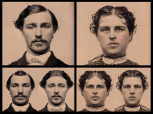 However, it’s good to remember that both sides are different enough that when you cut the face in half using a full frontal photograph, then combine each half with a flip-flopped image of itself to form a single portrait, then you wind up with some very interesting new faces. No face is totally symmetrical as the photos above attest. This particular visual exercise was first explored back in the early 90s when I was learning to work with QuarkXPress, using photographs of myself and other friends to show just how non-symmetrical our faces actually are.
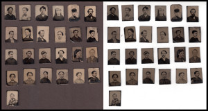 The photographs at left show the difference between scanning these tintypes against a black background (which reproduced as dark grey) versus a white background. Another variation on the old visual test comparing the size of black dots on a white background versus white dots on a black background. In this case, the experiment shows how much better the varieties of grey tone show up against a dark background than white. This photo also reveals how unevenly the tintypes are cut, obviously by hand without the aid of a machine to square cut the items.
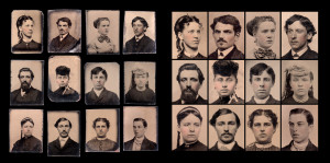 In the last experiment I’ve taken twelve of the tintypes – six men and six women – and cropped them at two levels of close-up to show the differences between portraiture seen from a distance, from close up, and
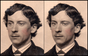
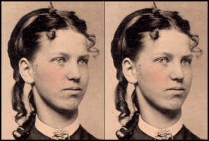
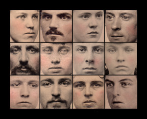 the in-your-face variety that I’m drawn to. Two of these young faces were also the basis for another interesting experiment, shown at the top of this posting, in which I manipulated the three-quarter portraits with the eyes staring straight ahead, by Photoshopping the eyes to look directly back at the viewer. This is one of my favorite experiments to show how much more powerful is portraiture in which the sitter looks back at you, rather than staring off into space; the difference between a more intimate connection with the sitter, as opposed to detached observation.
“It’s easy to fool the eye but it’s hard to fool the heart.” – Al Pacino (1940- )



{ 0 comments… add one now }