“When your work speaks for itself, don’t interrupt.” – Henry J. Kaiser (9 May 1882 – 24 Aug 1967)
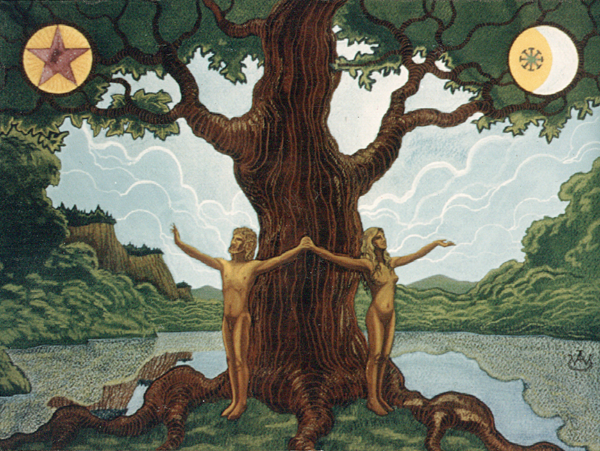 The Tree • watercolor and colored pencil on paper • ca. 14″ x 18″ • collection of Raymond Buckland
Some arts created as book cover illustrations were more personally satisfying than others, as I discovered over the twelve years I was associated with Samuel Weiser Inc. from 1974 to 1986. I wore numerous hats during that Jupiter-cycle time period, starting as invoice typist, soon moving on to book cover designer, chart illustrator, paste-up artist, even book packer on occasion; eventually becoming a copy-writer, newsletter producer, and art director. Don Weiser and his wife Betty Lundsted, author and astrologer, thankfully had more confidence in my abilities than I did. They also had patience and a forbearing love that got us through the more difficult times when my abilities as a team player were less than ideal – I was not an easy person to work with at times, being too often moody and overly self-critical. My strength was as an artist, but the artiste in me occasionally insisted on ramping up the drama. My astrologer friends would say that’s because of “no water” in my chart – all my planets are in ‘air’ or ‘fire’ elements, with a rising sign of Capricorn providing the only ‘earth’ connection. Drama Queen material. Be that as it may…
 …to return to my original comment about some cover illustrations being more satisfying than others to create: above is one of my personal favorites of the many illustrations created for Weisers; at left, how that finished work was printed as a wrap-around book cover. Done in early 1977, the art was a reflection of my own naturist tendencies. Admittedly I did not get around to reading the book The Tree that the art covered, but this was not that unusual for me as a book cover designer. My job was to design covers that would draw attention to the book and hopefully sell copies. The content was often beyond illustration anyway, which forced me to think more graphically using typography, a discipline that was not nearly as fulfilling as drawing and painting, which were the great challenge to me as self-taught illustrator. The artwork at the top of the posting is approximately what the original illustration looked like when finished. Immediately above is a copy of the second edition printing of the cover in the early 80s, showing how colors can shift between original art and its reproduction by 4-color offset printing. Needless to say, this disparity is one of the great disappointments numerous artists have always had to deal with when seeing their work reproduced, since the invention of the technology.
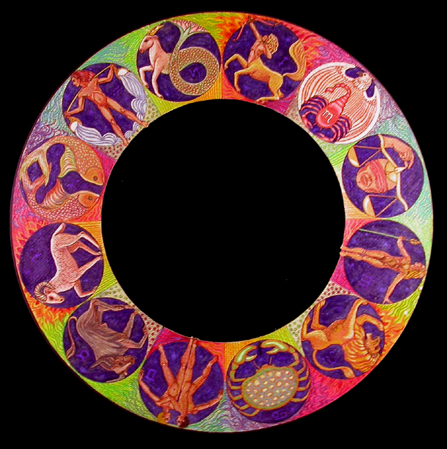 Zodiacal Wheel • watercolor and colored pencil on paper, ca. 16″ in diameter • collection of Tina Pappajohn, Philadelphia
One of many zodiacal wheels drawn during my Weiser tenure; many were colorfully painted and brought to completion as projects, but some were not reproduced, as the one here. The style as well as substrate indicates
 1977, which was the last year that my primary painting surface was paper. Thereafter, I turned to the more substantial surfaces of canvas and panel. At left, Between the Cherubim and Seraphim, one of three circular compositions created during that fall’s leisure for my own pleasure, all three done with colored pencils on black 120 lb. paper, 26″ diameter. The second at left, Whence?
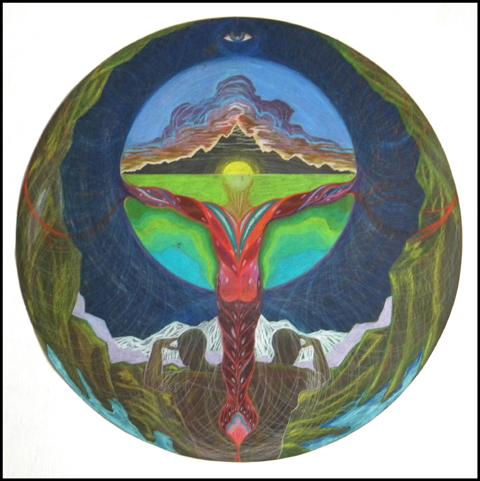 Whither? Why? #1. Both arts, collection of the artist • the third, not shown, collection of an admirer in Lyman, Maine.
The back-story for Monday, Wednesday and Thursday emails will be forthcoming…


{ 0 comments… add one now }