“To know yourself as the Being underneath the thinker, the stillness underneath the mental noise, the love and joy underneath the pain, is freedom, salvation, enlightenment.” – Eckhart Tolle (16 Feb 1948 – )
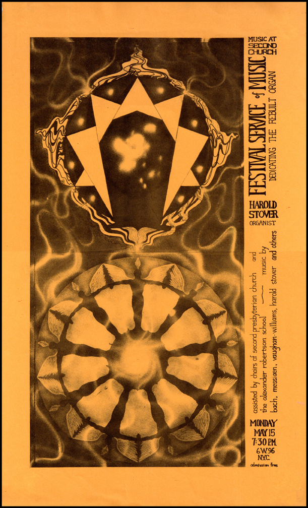
 1978: a project which focused my attention early in the new year was the 25th advertising flyer created for my friend Harold Stover’s series of concerts, held primarily at Second Presbyterian Church at 96th Street and Central Park West, where he was resident organist. All those earlier flyers have been featured in previous postings. However Stover occasionally played solo organ concerts at other venues, including Trinity Church on Wall Street, St. Patrick’s Cathedral and St. Thomas’ Episcopal Church, both on Fifth Avenue, even Notre Dame in Paris. The flyer above advertised a late February 1978 concert at St. Thomas’ which featured the first complete performance of Ezekiel – a galactic soundscape composed by Stover himself based on the meditations of Ezekiel the Prophet whose visions of wheels within wheels “way up in the middle of the air” was an inspiration to my own early childhood imagination, as well as Stover’s mature speculations in sound. I threw myself into the project with abandon, coming up with the intense Art Deco-like drawing – with shades of Art Nouveau thrown in for good measure – seen here, with eyes everywhere. This was only the fifth of the twenty-five flyers created to date where the art shared equal billing with the pertinent information. In the majority of the earlier flyers the art had merely acted as a background over which the type was printed. Some combinations of art and type worked better than others. I had learned through experience that the type-over-art technique oftentimes compromised the legibility of the important information, usually done in my own calligraphy, which provided its own challenges to legibility. The Ezekiel flyer was the fourth time I was using typeset headlines and body copy, using a variety of styles. Apparently I was still trying to provide a challenge to those seeking information about where and when the concert was to take place, because I ran some of the copy up the side of the piece, necessitating turning the piece 90 degrees to read. Another case of living and learning a new trade by being experimental and making less than ideal choices; more usually called mistakes…
 At left is the how the original pen & ink drawing, provenance now unknown, looked before being printed on goldenrod paper, the signature color of the series. I’d like to add here that St. Thomas’ was one of the first churches in Manhattan that I became familiar with before moving to NYC in ’68. I was still in the Air Force stationed in Massachusetts at Westover AFB, when I first discovered the awe-inspiring silence this church offers to those who take the time to ascend the granite stairs to step inside one of the most understatedly elegant houses of worship I have ever had the privilege to be in, and feel the surround of. The profound impact of the carved marble reredos with the blue stained glass window behind it is beyond my ability to describe accurately in words (perhaps I’ll try eventually in a painting). The church’s surprisingly peaceful ambience just feet away from a frantically busy Fifth Avenue in midtown shatters preconceptions of what can exist in a city like New York; utterly different from the atmosphere of St. Patricks just three blocks away, which experiences a constant hubbub of tourist activity from the moment it opens its doors at 6:30 a.m. until closing time at 8:45 p.m.
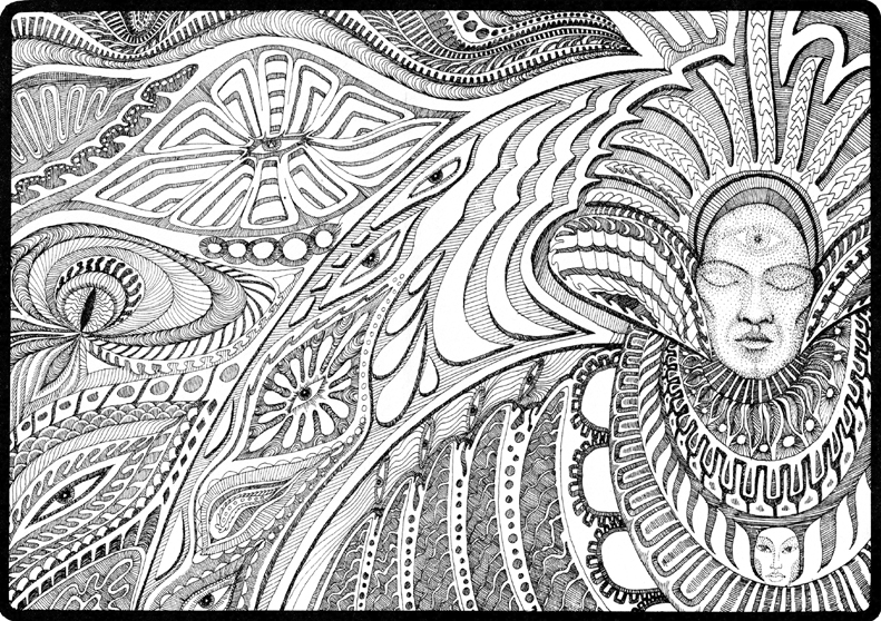
 Later in the spring, I created artwork which was used in another difficult-to-read flyer designed for Stover, seen at left. It must have been the times that celebrated the creation of graphics that were challenging to read, or perhaps it was just my exploration of the graphic medium that was still relatively new to me – learned ‘on the job’ – which I was enjoying the experimental nature of, just because I could. I was obviously on a roll with wheels with this piece of art, seen in black & white below. There’s even a Gurdjieff-inspired enneagram thrown in for good measure. After all I was still working at Weisers, New York’s occult
 emporium, down in Greenwich Village, where many of the world’s eclectic spiritual interests found printed expression as well as an audience. My superficial exposure to such a wide variety of disciplines and interests provided a novice such as myself with a stimulus to experiment by using many varieties of symbology in my work, much of which was beyond my understanding. The major emotion I felt regarding their use was that it was ‘cool’ to be investing my work with such signs. Ignorance is bliss they say; but ultimately it didn’t protect me from my wayward ways which eventually caught up with me late in the year. In the meantime though, I was having fun, living the wild and crazy life of a foot-loose and fancy-free sad-gay man in New York City: a troubled accident just waiting to happen. Next posting will deal with my transforming trip to Santa Fe in June of that same fateful year, 1978…


{ 0 comments… add one now }