 Artwork created for use in a print-ad for Lotrisone, an anti-fungal cream produced by Merck & Co., one of the major clients of Roberts & Raymond Associates, the Philadelphia advertising agency for whom I worked from 1986-96, my first decade in the city.
On May 1, 1986 when I arrived in Philadelphia, I was jobless; and I really didn’t have much cash in hand, the result of living close to the edge financially all my adult life to that point. I felt somewhat desperate, but at least I had an apartment; provided by JMH, the man I had moved here to study with. I had accepted his suggestion to come to Philadelphia on blind faith, committing myself to study for two years, this man whom I knew through the Weisers and had met in person only three times. As per a verbal agreement made earlier in January, after the two years were up I was free to go wherever I chose, hopefully in a better state of mind than I arrived.
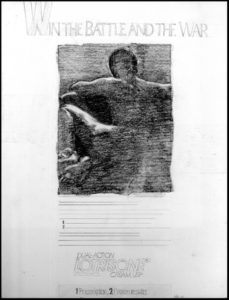 WIN THE BATTLE AND THE WAR • Tight pencil comp – a mockup of an ad proposed to Merck & Co. for promoting Lotrisone. Art director: Lisa Volpe
Job hunting was not my forte, the result of negative experiences in NYC prior to joining up with the Weisers, with whom I had worked the prior twelve years. My initial job searches were fruitless and a bit disheartening. I vacillated about how to promote myself: as a graphic designer? or as an illustrator?? I didn’t feel particularly outstanding as either. The fashion world I had been trained to be part of through RISD seemed way behind me in time (twelve years). However that didn’t stop me from flirting briefly with the idea of pulling together a fashion portfolio, after all these years and trying to get some work in that world again. However, I eventually found work in advertising, and lost interest in pursuing that particular chimera, as I settled more comfortably into living in a whole new world – a big city once again.
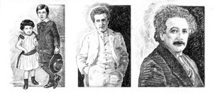 Pencil sketches of Albert Einstein for a promotional piece being pitched to Macmillan Publishers. Art director: Lenore Pittenger
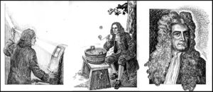 Pencil sketches of Isaac Newton for a promotional piece being pitched to Macmillan Publishers. Art director: Lenore Pittenger
In mid June through the auspices of DJ, a fellow student of JMH, who was also free-lancing in the graphics arts business, I was connected with LP, an art director at Roberts & Raymond Associates, a small advertising agency at St. James and 22nd Streets on the west side of town, headed by RS, a man with expansive plans for growing the family business of Sulpizio Associates, an advertising design firm, to the status of being a full-service Advertising Agency. I started free-lancing as a Production Artist, a title I was unfamiliar with at the time, but had been fulfilling for quite some time while working for Weisers: being a paste-up artist, working at a drawing board with a parallel rule.
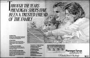 Tight pencil comp for a 2-page spread advertising Phenergan, a Wyeth Pharmaceuticals product. Art director for this as well as the three color spreads that follow: Lenore Pittenger
When I first started working for R&R, their major client was Macmillan Publishers. My initial role was as a paste-up artist taking art director LP’s ideas and preparing mechanicals for print reproduction. After discovering that I had considerable background experience as an artist, LP asked me to prepare a series of drawings of both Albert Einstein and Issac Newton (above) for a printed piece the agency was pitching to Macmillan. These were my first comp illustrations for R&R, which introduced me yet again to the joys of tracing. Drawing comps in either regular or colored pencil was one of the most relaxing and pleasurable tasks I was required to perform as a freelancer and eventual full-time employee.
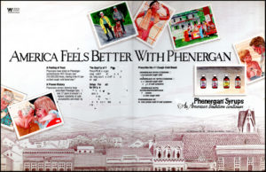 By the time I created the b&w pencil comp above, the focus of R&R’s business had shifted to print advertising for pharmaceutical manufacturers, for which the Delaware Valley area is well known. Wyeth Brothers was a major client, with Phenergan being one of their most popular, well-known products, for which we pitched a number of ideas. The colored pencil comps at left and below were three of the most ambitious and time-consuming comps I created for the agency, at a time before computers totally changed the face of advertising.
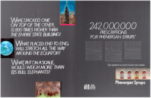 Before that change occurred however, I was still required to create the occasional full-color rendition of what the art director proposed the finished two-page spread ad would look like when actually printed. In the piece at left, not only did I draw the small spot illustrations, I hand-lettered all the type with a fine brush and white paint. The illustrations were a pleasure to create compared to the letters, which were literally a pain – shades of carpel tunnel syndrome – although I did feel a great sense of accomplishment when the job was completed.
 In the colored pencil comp at left, the most ambitious in terms of human portrayal, I reveal myself as an old man, little did I know it at the time. I was in my mid-40s when I drew this illustration, basing the old man of the group somewhat consciously, maybe a lot unconsciously, on my own father who was in his late 70s at the time. Looking at the drawing now, I understand the accuracy of the comment that all portraits have qualities of self-portraiture, some more obvious than others.
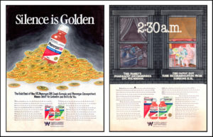
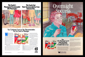 At left and below, four single page ad comps for Phenergan. Art director: Mark Redmond
These were four of the last comp illustrations I created for R&R around 1991, shortly before the computer revolution altered our working habits and changed the graphic arts business forever. It would be a curiosity to see the quick pencil sketches by the art directors with whom I worked, from which I developed these illustrations that were to suggest photography to the client. Some of these illustrations were obviously more successful in that illusion than others. Ultimately I’m clueless about what happened with these ideas once they left my desk. I was on to the next project…


{ 0 comments… add one now }