“Teachers open the door, but you must enter by yourself.” – Chinese Proverb
 Starting in the spring of 1975 I learned a new craft – designing book covers for trade paperbacks.
 I had been working for Samuel Weiser Inc. as an invoice typist when my big break came along, allowing me to explore a new career as a graphic designer.
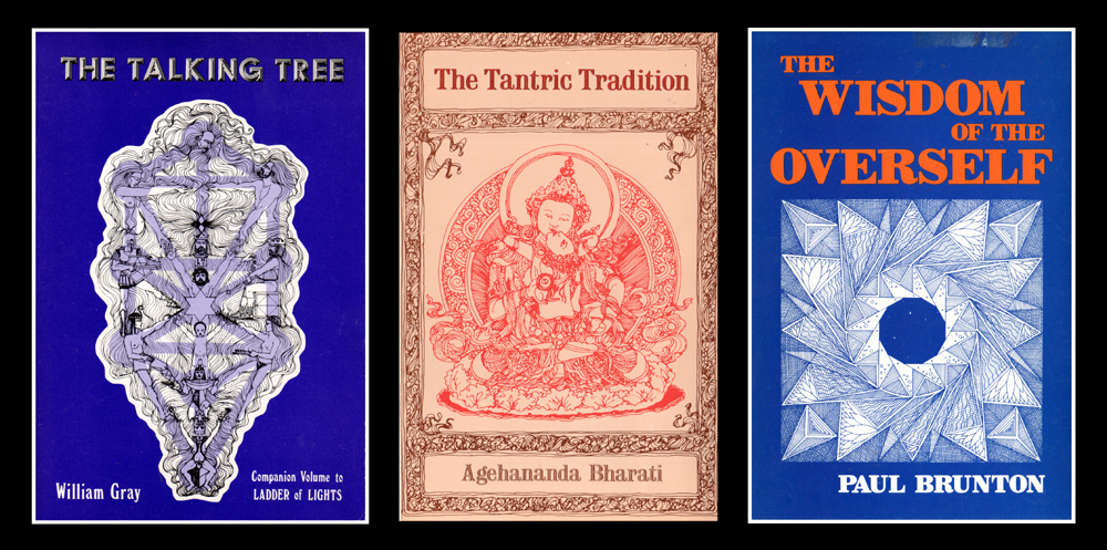
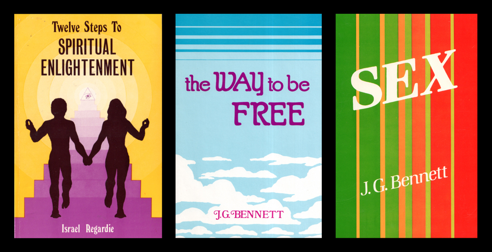 The economics of specialty publishing often made it necessary to design covers using a palette limited to two or three colors. Featured at left are a series of covers showing how I worked within such limitations. Did I have to read the books before I designed the covers? Fortunately not, although I might have better served myself if I had read a number of them. My immediate concern at the time was to create an eye-catching graphic, visible from a distance, that would attract the eye of a potential buyer. Some covers worked better than others. Needless to say, red was a popular color, a proven attention-getter, one that I used often, in combination with black and many another color.
 Sometime in the late 70s I acquired an airbrush and started experimenting with creating printer-ready mechanicals using a limited number of colors.
 I had to create individual overlays in black for each color, a process that became increasingly complex as my airbrush experiments became more ambitious.
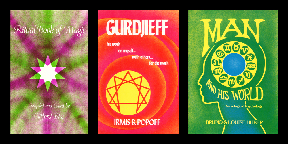
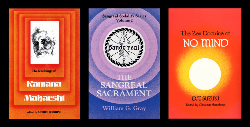
 Above, three air-brushed covers printed in two colors, some of the happier results of those early experiments. At left six later covers that were some of the more ambitious air-brush projects where I sought to create multiple colors using just three printing inks.


{ 0 comments… add one now }