“You have succeeded in life when all you really want is only what you really need.” – Vernon Howard (1918-1992)
 Tthere were two kinds of 4-color book covers that I designed while working for Samuel Weiser Inc., book publisher, in the late 70s.
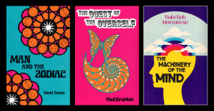 The less-expensive variety used any four colored inks chosen from the Pantone Matching System (PMS color-swatch book), which involved my creating a printer-ready mechanical with separate plates for each color, a time consuming and often tedious task. Both the Vera Stanley Alder series pictured at the top, as well as the three brightly colored covers above were created in this manner. A great learning experience that involved technical precision and patience.
 The more expensive variety was known as camera-separated 4-color Process Printing, which involved the creation of an original work of art which was then handed off to an offset printer for separations,
 rather than my creating separations in black on individual plates representing each color. Opportunities to create full-color illustrations came along rarely, and I learned to look forward to them.
 The challenge was creating art, not making a mechanical. I got to feel like an artist drawing and painting, rather than just a graphic designer moving type elements around.
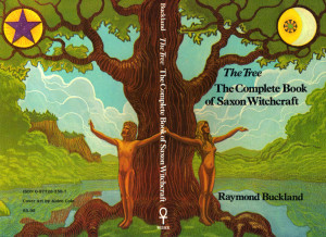
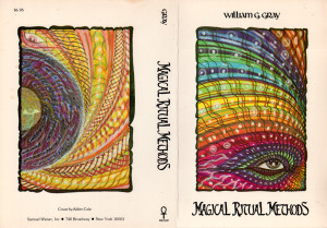 Above and at left are some of the earliest printed book covers using illustrations I created especially for them. Most fun were the times when I was allowed to create art for a “wrap around” book cover, where the art extended onto the spine and back cover as well.
 These opportunities were particularly welcome. The five covers at left are all examples of this kind of work.




{ 0 comments… add one now }